Posted on 4 Comments

What’s the deal with the File Browser tab in Decent Sampler?

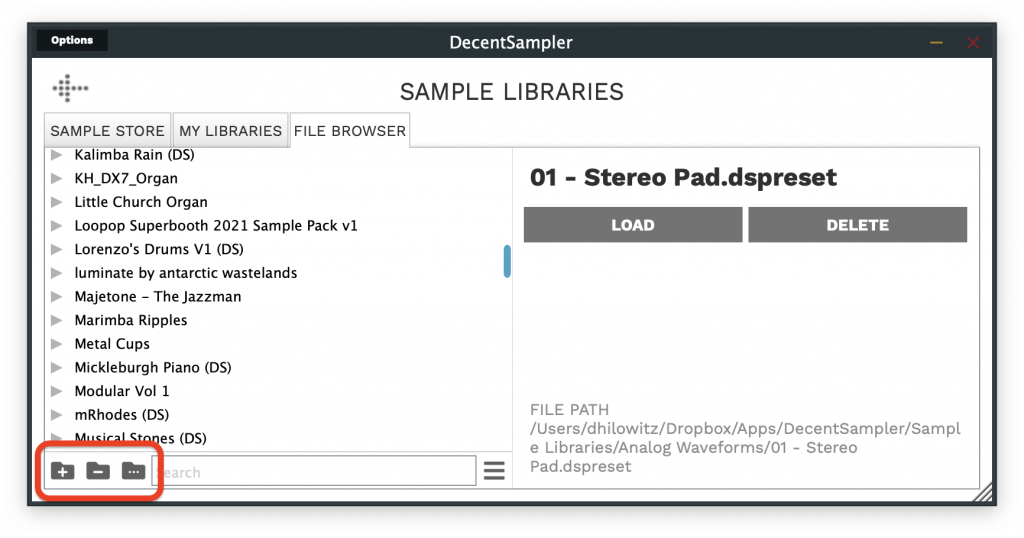
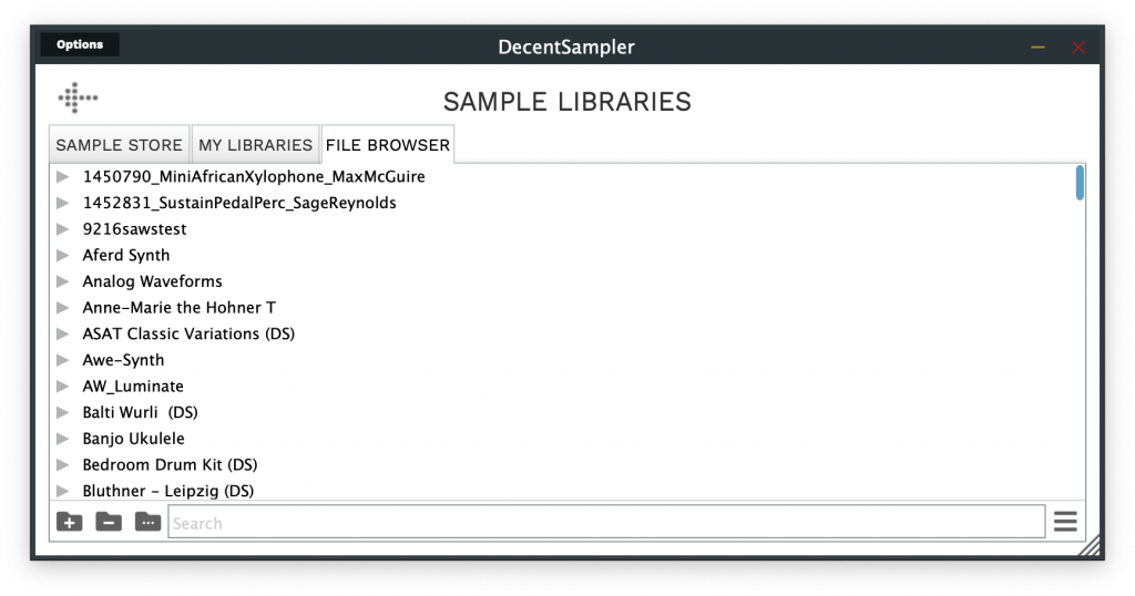
So, the latest version of Decent Sampler (1.7.6) has a new tab within the BROWSE screen called File Browser:

The Decent Sampler File Browser tab
The Decent Sampler “File Browser” tab

This looks and functions almost exactly like the My Libraries tab. In fact, I’m hoping that we will be able to get rid of the My Libraries tab in favor of the File Browser soon, and when that happens I will probably just rename File Browser back to My Libraries and new users won’t know the difference. Both the File Browser and the old My Libraries aim to allow users to manage and load sample libraries from their own personal collections, but there are important differences in the way the two tabs work which is why I’m writing this post.

What the My Libraries tab was meant to be and where it fell short

Under the hood, Decent Sampler maintains a small, lightweight database that contains the locations of all of the sample libraries in a user’s personal collection. The plan was originally that the My Libraries tab would be used to manage this database. Every time a user loaded a Decent Sampler library, it would be added to the database, and from that point on it could be managed within the My Libraries tab. The My Libraries tab even offered the possibility of creating virtual folders to help with organizing sample libraries. This seemed like a great solution until I tried to use it for an extended period of time (I’m not only the creator of Decent Sampler, I’m also an avid user).

For desktop users, it is much easier to manage a folder containing many sample libraries using the tools provided by your operating system. Users (including me) would rename sample libraries on disk, delete them, or move them into folders that made logical sense. In such situations, the result would be that the reality as reflected in the database was often be different than what was on disk, and it was often difficult or even impossible to sync them up. To make matters more complicated, iOS users didn’t have the option of using the OS to manage their files well because, due to iOS limitations, all of their DecentSampler libraries are stored in a siloed file container called an AppGroup. Since the AppGroup is not accessible by the iOS Files app, users literally had no way of managing their files other than my using the My Libraries tab, which meant that if something went wrong with the internal database, they would be completely in the dark and stuck with useless files that were using up their precious device storage.

The Solution: The new File Browser tab

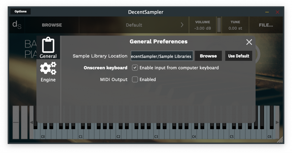
The new File Browser tab offers an accurate picture of whatever is stored in your Sample Libraries folder. For desktop users, this is the folder that you specified when you first launched the app, or that you chose in the Preferences dialog box. If you’re not sure where your Sample Libraries directory is, you can check its location by going to the Preferences dialog box and looking at the Sample Library Location entry (this option is not available on iOS):

Choosing a new sample library location in the General Preferences dialog box

As mentioned earlier, the new File Browser tab aims to provide an accurate list of the folders and files as they exist on disk. In the bottom left-hand corner are three icons which allows you to create, rename, and delete folders.

The add, remove, and rename folder buttons

Unlike the folders that are created in the My Libraries tab, the folders in the File Browser are real folders that exist on disk. Be careful, if you delete a folder containing a bunch of sample libraries, the sample libraries contained with will be deleted as well (just like they would be on your operating system).

This view is very much a work in progress. (For example, at the time of writing, the search functionality is very slow on the file browser tab because every time it performs a search, it goes through the entire tree. This will be fixed in upcoming versions.) I wanted nonetheless to share the work in progress to let you all know the direction I’m hoping to take, as well as to get feedback from users and developers.

Enjoy!
– Dave

Posted on Leave a comment

For Sample Creators: How to use the Wavefolder and Waveshaper effects

Oscilloscope view of a sawtooth wave form that has been folding back on itself.

Decent Sampler v1.7.3 introduces the new wave folder and wave shaper effects. These can be used to add extra harmonic content to your signals (aka distortion). What both of these effects have in common is that they usually sound much better when applied to a single voice rather than to an entire signal. In Decent Sampler, it is possible to apply effects at the voice level by attaching them to groups. Since each group is triggered independently, they do not share effects. In other words, each time you hit a key, a new copy of that voice will be created.

Wave folder

The wave_folder effect allows you to fold a waveform back on itself. This is very useful for generating additional harmonic content. Here is what that looks like in practice:

Oscilloscope view of a sawtooth wave form before wavefolding
Sawtooth waveform before wavefolding
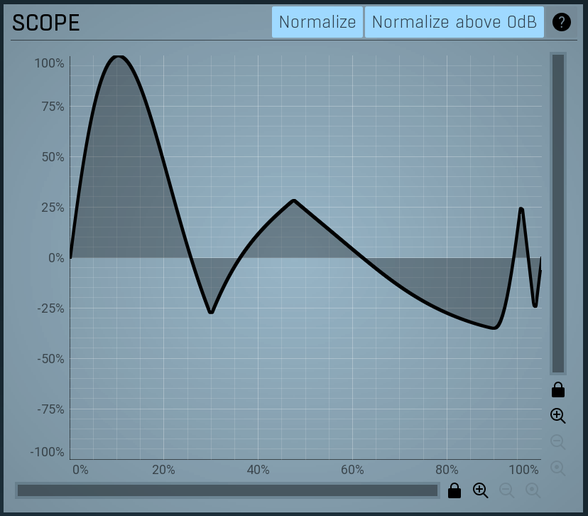
Oscilloscope view of a sawtooth wave form after wavefolding
The same sawtooth wave form after wavefolding

These are the parameters that can be controlled:

AttributeTypeValid RangeDefault
typeRequiredMust be wave_folderwave_folder
driveOptionalThe volume of the input signal1 – 100, where 100 means the signal is amplified by a factor of 100 and 1 means no amplification is applied1
thresholdOptionalThe amplitude above which wave folding should take place0 – 10.00.25
Wavefolder parameters

Because wave folding tends to sound better when applied on a per-voice basis, it usually makes sense to set up the wave folder at the group level (separate group effects get created for each keypress). Example:

<?xml version="1.0" encoding="UTF-8"?>
<DecentSampler pluginVersion="1">
  <ui>
    <tab>
      <labeled-knob x="180" y="40" label="Drive" type="float" minValue="1" maxValue="100" textColor="FF000000" value="1">
        <binding type="effect" level="group" groupIndex="0" effectIndex="1" parameter="FX_DRIVE" translation="linear" />
      </labeled-knob>
      <labeled-knob x="280" y="40" label="Threshold" type="float" minValue="0" maxValue="1" value="1" textColor="FF000000">
        <binding type="effect" level="group" groupIndex="0" effectIndex="1" parameter="FX_THRESHOLD" translation="linear" />
      </labeled-knob>
    </tab>
  </ui>
  <groups>
    <group>
      <!-- samples go here -->
      <effects>
        <effect type="lowpass_4pl" resonance="1" frequency="500" />
        <effect type="wave_folder" drive="1" threshold="1" />
      </effects>
    </group>
  </groups>
  
</DecentSampler>
Code language: HTML, XML (xml)

Waveshaper

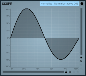
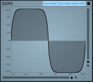
The wave_shaper effect allows you to apply standard tanh waveshaping to your input signal. Here are some examples what that looks like in practice:

An oscilloscope display of an example of sine wave before wave shaping is applied.
A sine wave before wave shaping is applied
An oscilloscope display of a sine wave after wave shaping is applied.
A sine wave after wave shaping is applied

There are a few parameters which can be controlled:

AttributeTypeValid RangeDefault
typeRequiredMust be wave_shaperwave_folder
driveOptionalThe amount of distortion. This really just controls the volume of the input signal.1 to 1000 where 1 means no change to the input signal and 1000 means the amplitude is multiplied by a factor of 1000.1
driveBoostOptionalChanges the character of distortion that gets produced0 – 1.00
outputLevelOptionalThe linear output level of the signal0 – 1.00.1
Waveshaper parameters

Because wave shaping tends to sound better when applied on a per-voice basis, it usually makes sense to set up the wave shaper at the group level (separate group effects get created for each keypress). Example:

<DecentSampler pluginVersion="1">
  <ui>
    <tab>
      <labeled-knob x="180" y="40" label="Drive" type="float" minValue="0" maxValue="1000" textColor="FF000000" value="0.5473124980926514">
        <binding type="effect" level="group" groupIndex="0" effectIndex="0" parameter="FX_DRIVE" translation="linear"/>
      </labeled-knob>
      <labeled-knob x="280" y="40" label="Boost" type="float" minValue="0" maxValue="1" value="0.328312486410141" textColor="FF000000">
        <binding type="effect" level="group" groupIndex="0" effectIndex="0" parameter="FX_DRIVE_BOOST" translation="linear"/>
      </labeled-knob>
      <labeled-knob x="380" y="40" label="Output Lvl" type="float" minValue="0" maxValue="1" value="0.1" textColor="FF000000">
        <binding type="effect" level="group" groupIndex="0" effectIndex="0" parameter="FX_OUTPUT_LEVEL" translation="linear"/>
      </labeled-knob>
    </tab>
  </ui>
  <groups>
    <group>
        <em><!-- Samples go here. --></em>
      <effects>
        <effect type="wave_shaper" drive="0.5473124980926514" driveBoost="0.328312486410141" outputLevel="0.1"/>
      </effects>
    </group>
  </groups>
Code language: HTML, XML (xml)

Examples

The examples from this blog post can be download here.

Posted on 5 Comments

For Sample Creators: How to create buttons in your sample libraries

A screenshot of Decent Sampler showing a button.

Well, it finally happened, version 1.7.0 of Decent Sampler introduces the concept of buttons to the world of Decent Sampler. To make a button in you user interface, simply use a <button> element:

<button x="10" y="40"  width="120" height="30" style="image" value="0" mainImage="samples/ButtonMainImage.png" hoverImage="samples/ButtonHoverImage.png" clickImage="samples/ButtonSelectedImage.png">
    <!-- Your button states go here. These are defined using the <state> element. -->
</button>
Code language: HTML, XML (xml)

There are two types of buttons: text and image. The value of the style attribute determines which kind of button gets created.

Text Buttons

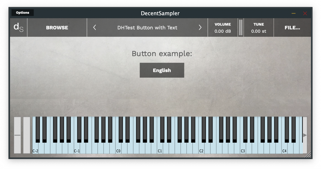
Text buttons are pretty basic, they look like this:

An example of a text button

Here is the code for this button:

<button x="350" y="70"  width="120" height="40" style="text">
  <state name="English">
    <!-- Bindings go here -->
  </state>
  <state name="French">
    <!-- Bindings go here -->
  </state>
</button>
Code language: HTML, XML (xml)

As you can see, the actual text that gets displayed is defined in the name= parameter of each <state> element.

Image Buttons

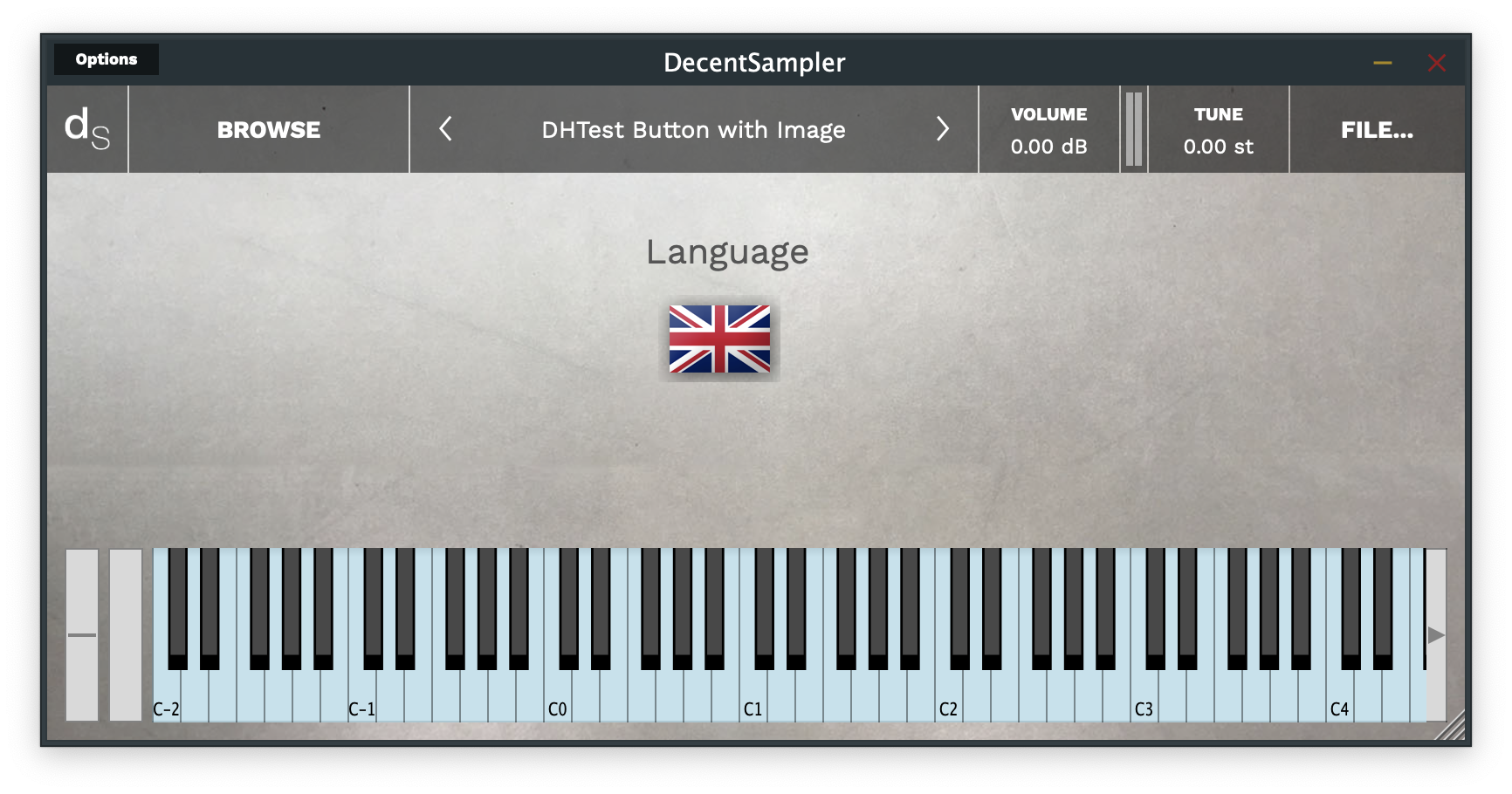
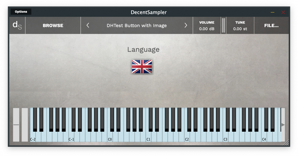
Now, let’s look at the image button. Here, you can use any image you want (even these ugly flag buttons I made in about 20 seconds in Photoshop):

An example of an image button

The code for this button is as follows:

<button x="350" y="70"  width="70" height="50" style="image" value="0" >
    <state name="English" mainImage="samples/EFlag_MainImage.png" hoverImage="samples/EFlag_HoverImage.png" clickImage="samples/EFlag_SelectedImage.png">  
    </state>
    <state name="French" mainImage="Samples/FFlag_MainImage.png" hoverImage="Samples/FFlag_HoverImage.png" clickImage="Samples/FFlag_SelectedImage.png">
    </state>
</button>
Code language: HTML, XML (xml)

As you can see, each <state> has three image parameters. Only the first one, mainImage, is required:

mainImageThe path of the main image to display for this button. This can also be set at the state level so that it only applies to a specific state. (required)
hoverImageThe path of the main image to display when the user hovers their mouse over this button. This can also be set at the state level so that it only applies to a specific state. (optional)
clickImageThe path of the main image to display when the user clicks down on this button. This can also be set at the state level so that it only applies to a specific state. (optional)
<state> parameters for buttons with the image style

Bindings

Of course, if you want your buttons to actually do something, you’ll need to put <binding> elements underneath the <state> elements:

<button x="350" y="70"  width="120" height="40" style="text">
  <state name="English">
    <binding type="general" level="group" position="0" parameter="ENABLED" translation="fixed_value" translationValue="true" />
    <binding type="general" level="group" position="1" parameter="ENABLED" translation="fixed_value" translationValue="false" />
  </state>
  <state name="French">
    <binding type="general" level="group" position="1" parameter="ENABLED" translation="fixed_value" translationValue="true" />
    <binding type="general" level="group" position="0" parameter="ENABLED" translation="fixed_value" translationValue="false" />
  </state>
</button>
Code language: HTML, XML (xml)

As you can see, the example above uses a button to switch between two groups. You’ll note the liberal use of the fixed_valuetranslation mode above. This means that when any of these options are selected, a fixed predetermined value is used for the value of that binding.

Conclusion & Examples

OK. I think that’s it. You can download the examples used in this blog post here. If you find any bugs having to do with buttons, make sure you report them here.

Posted on 16 Comments

For Sample Creators: How to use Convolution in your Decent Sampler presets

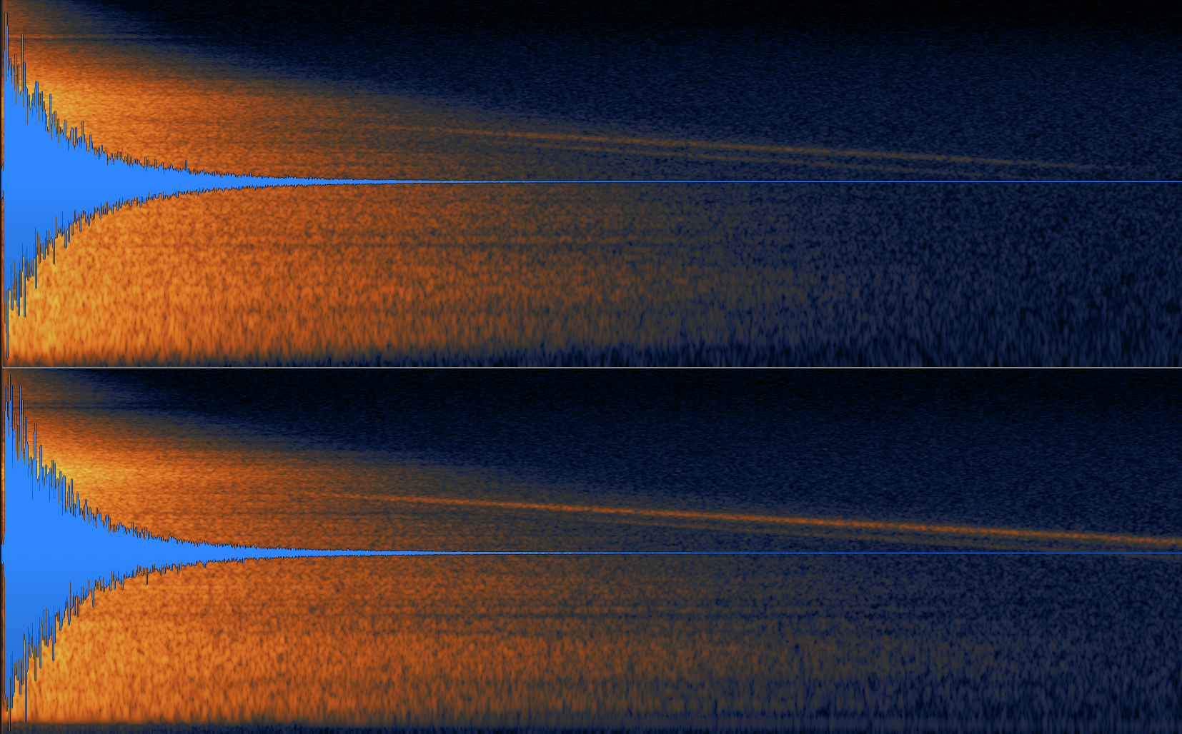
A spectrogram of a convolution reverb impulse response.

Version 1.6.12 of Decent Sampler brings a Convolution effect to the Decent Sampler platform. If you don’t know what Convolution is, you can see a great explanation here. The most common use case for convolution is in creating reverb, and that is the use case that will be demonstrated here.

How to add the Convolution effect to a preset

The convolution effect is invoked in much the same way that any other effect is defined:

<effects>
  <effect type="convolution" mix="0.5" irFile="Samples/Hall_IR.wav" />
</effects>Code language: HTML, XML (xml)

As you can see, other than the required type attribute, there are two other attributes:

  • The mix attribute controls how much of the convolved signal is present in the output. A value of 0 is completely dry whereas a value of 1 is completely wet containing only the convolved signal.
  • The irFile attribute specifies the file that should be used as an impulse response or IR.

How to control the convolution effect using UI controls

Two of the convolution effect’s attributes can be controlled using UI controls. The mix level can be controlled by a knob as follows:

<labeled-knob x="680" y="40" label="Conv Mix" type="float" minValue="0" maxValue="1" value="0.5" textColor="FF000000" >
  <binding type="effect" level="instrument" position="0" parameter="FX_MIX" translation="linear"  />
</labeled-knob>Code language: HTML, XML (xml)

The IR impulse can be changed dynamically using a menu control:

<label text="IR File" x="480" y="40" width="120" height="30"></label>
<menu x="580" y="40"  width="120" height="30" requireSelection="true" placeholderText="Choose..." value="1">
  <option name="long hall.wav">
    <binding type="effect" level="instrument" position="1" parameter="FX_IR_FILE" translation="fixed_value" translationValue="Samples/long hall.wav" />
  </option>
  <option name="ABLCR Chord Vocal.aif">
   <binding type="effect" level="instrument" position="1" parameter="FX_IR_FILE" translation="fixed_value" translationValue="Samples/ABLCR Chord Vocal.aif" />
  </option>
  <option name="Amp Spring High.aif">
    <binding type="effect" level="instrument" position="1" parameter="FX_IR_FILE" translation="fixed_value" translationValue="Samples/Amp Spring High.aif" />
  </option>
  <option name="Swede Plate 3.5s.aif">
    <binding type="effect" level="instrument" position="1" parameter="FX_IR_FILE" translation="fixed_value" translationValue="Samples/Swede Plate 3.5s.aif" />
  </option>
</menu>Code language: HTML, XML (xml)

Examples

An example Decent Sampler preset that uses IR reverb can be downloaded here. (You’ll want to check out the example-003-how-to-use-convolution-reverb folder.)

Performance considerations

While convolution is a powerful tool that can go a long way towards shaping a sample library’s sound, it can also be quite costly in terms of CPU usage. Sample creators would do well to create versions both with and without convolution effect and compare the relative CPU usage of the two versions before opting to use convolution.

Posted on 11 Comments

How to add LFOs and extra envelopes to your Decent Sampler instruments

As for version 1.5.24 of Decent Sampler, it is now possible to make use of LFOs and ADSR envelopes in your Decent Sampler sample libraries. In this blog post, we’ll go through how to set these up.

The <modulators> section

This is a new section that lives below the top-level <DecentSampler> element and it is where all modulators for the entire sample library live:

<DecentSampler>
    <modulators>
        <!-- Your modulators go here. -->
    </modulators>
</DecentSampler>

The <lfo> element

Underneath the <modulators> section, you can have any number of different LFOs, which are defined using an <lfo> element, for example:

<modulators>1
  <lfo shape="sine" frequency="2" modAmount="1.0"></lfo>
</modulators>

This element has the following attributes:

  • shape: controls the oscillator shape. Possible values are sine, square, saw.
  • frequency: The speed of the LFO in cycles per second. For example, a value of 10 would mean that the waveform repeats ten times per second.
  • modAmount: This value between 0 and 1 controls how much the modulation affects the things it is targeting. In conventional terms, this is like the modulation depth. Default value: 1.0.
  • scope: Whether or not this LFO exists for all notes or whether each keypress gets its own LFO. Possible values are global (default for LFOs) and voice. If voice is chosen, a new LFO is started each time a new note is pressed.

The <envelope> element

In addition to LFOs, you can also have additional ADSR envelopes. These can be useful for controlling group-level effects, such as low-pass filters. If this is what you wish to achieve, make sure you check out the section on group-level effects below.

To create an envelope, use an <envelope> element:

This element has the following attributes:

  • attack: The length in seconds of the attack portion of the ADSR envelope
  • decay: The length in seconds of the decay portion of the ADSR envelope
  • sustain: The height of the sustain portion of the ADSR envelope. This is expressed as a value between 0 and 1.
  • release: The length in seconds of the release portion of the ADSR envelope
  • modAmount: This value between 0 and 1 controls how much the modulation affects the things it is targeting. In conventional terms, this is like the modulation depth. Default value: 1.0.
  • scope: Whether or not this LFO exists for all notes or whether each keypress gets its own LFO. Possible values are global and voice (default for envelopes). If voice is chosen, a new LFO is started each time a new note is pressed.

How to use bindings in conjunction with modulators

In order to actually have your LFOs and envelopes do anything, you need to have bindings under them. If you are not familiar with the concept of bindings, you may want to read this section of the File Format Reference Guide and then return here. Bindings tell the engine which parameters the LFO should be affecting and how. Here is an example:

<modulators>
    <lfo shape="sine" frequency="2" modAmount="1.0">
        <!-- This binding modifies the frequency of a low-pass filter  -->
        <binding type="effect" level="instrument" effectIndex="0" parameter="FX_FILTER_FREQUENCY" modBehavior="add" translation="linear" translationOutputMin="0" translationOutputMax="2000.0"  />
    </lfo>
</modulators>

This is Example 1 from the example pack you can download here.

How modulator bindings differ from knob or MIDI bindings

If you’re already familiar with the concept of bindings, then you’ll want to read this section especially careful as you may notice a few difference between bindings as they are used by knobs and the ones used by modulators. Specifically, when you move a UI control that has a binding attached, the engine actually goes out and changes the value of the parameter that is targeted by that binding. For example, if you have a knob that controls a lowpass filter’s cutoff frequency, moving that knob will cause that actual frequency of that filter to change. In other words, the changes that the knob is making on the underlying sample library are permanent. The same is also true for bindings associated with MIDI continuous controllers.

Modulators, on the other hand, do not work this way. If a modulator (such as an LFO) changes its value, the engine looks at the bindings associated with that LFO and then makes a list of temporary changes to the underlying data. When it comes time to render out the effect, it consults both the permanent value and the temporary modulation values. As a result of this difference in the way bindings are handled, only some parameters are “modulatable.” At time of press, the following parameters are modulatable:

  • All gain effect parameters
  • All delay effect parameters
  • All phaser effect parameters
  • All filter effect parameters
  • All reverb effect parameters
  • All chorus effect parameters
  • Group Volume
  • Global Volume
  • Group Pan
  • Global Pan
  • Group Tuning
  • Global Tuning

The new modBehavior parameter for bindings

Another new feature of bindings is the addition of the modBehavior attribute. This controls exactly what effect a binding actually has on the parameter it is targeting. There are three possible values for this:

  • set: This means that the value that is generated by the binding becomes the new value for the parameter being targeted. NOTE: set is the default value and this is the way that knobs and MIDI CC bindings work by default. That being said, it’s usually not the correct choice for modulations such as LFOs and secondary ADSR envelopes.
  • add: The value generated by the binding gets added to the current value of the parameter being targeted.
  • multiply: The value generated by the binding gets multiplied with the current value of the parameter being targeted.

In order to understand what any of this means, let’s look at the following example:

<effects>
    <effect type="lowpass" frequency="60.0"/>
</effects>
<modulators>
    <lfo shape="sine" frequency="2" modAmount="1.0">
        <binding type="effect" level="instrument" position="0" parameter="FX_FILTER_FREQUENCY" translation="linear" translationOutputMin="0" translationOutputMax="2000.0" modBehavior="add" />
    </lfo>
</modulators>

The <lfo> tag above sets up an LFO with a frequency of 2 Hz. It has just one binding, which targets the first global effect, which happens to be a low-pass filter with a cutoff frequency of 60Hz. Every binding can be seen as a pipe that takes an input value, translates that value in some fashion, and then sets a parameter somewhere else in the engine. Here are the steps for this setup:

  1. By default, an LFO generates values between -1.0 and 1.0.
  2. These values then get passed to the binding, which is setup to do a linear translation. This linear translation has a minimum of 0 and maximum of 2000, which means that when the LFO is at its lowest point (-1.0) the binding will generate the number 0 (the minimum) and when the LFO is at its highest point (1.0), the binding will generate the number 2000 (the maximum).
  3. Because the modBehavior value is add, this new value that is generated by the binding will be added to the original cutoff value of 60Hz. This means that when the LFO is at its lowest point, the filter cutoff will be 60Hz (i.e. 60 + 0) and when its at its highest point, the filter cutoff will be 2060Hz (i.e. 60 + 2000).

LFO Scope: Global or Voice-level

By default, all modulators will be created at the global level. This means that there will be exactly one modulator that is shared by all voices. In many situations, such as an LFO modulating a single low-pass filter which is shared by all of voices, this is often what we want.

But there are other situations where we don’t want our modulator to be global. For example, what if we want to have an envelope that targets a low-pass filter. Let’s say that when we press down on a key, we want that low-pass filter to open up slowly until, 2 seconds later, it reaches its peak. In theory, we could set up something like this:


<effects>
    <effect type="lowpass" frequency="60.0"/>
  </effects>
<modulators>
    <envelope attack="2" decay="0" sustain="1" release="0.5" modAmount="1.0">
        <binding type="effect" level="instrument" position="0" parameter="FX_FILTER_FREQUENCY" translation="linear" translationOutputMin="0" translationOutputMax="4000.0" modBehavior="add" />
    </envelope>
</modulators>

But there’s a problem with this: let’s imagine that we hit a note, and then one second into that first note, we hit another note. If we have just a single envelope, that envelope will be half-way through its attack phase when the second key is pressed. Depending on how the envelope is configured, that envelope will either retrigger because of the new keypress (this would be the wrong behavior for the first note which is still being held) or keep going in which case the second note will start half way through its attack phase.

To solve this problem, in such cases, we need tell the engine to create a separate modulator for every keypress. To do this we add a scope="voice" attribute to the modulator as follows:

<envelope attack="2" decay="0" sustain="1" release="0.5" modAmount="1.0" scope="voice">

But wait, there’s another problem! In the scenario above, even if we have separate modulator for every keypress, those voices are still all sharing a single global low-pass filter. If you’ve got several modulators pinned to the same global effect, they are going to be setting and resetting that global effect’s parameters to competing values. The engine is going to be at war with itself of which envelope’s values are the correct setting for the filter’s cutoff. In other words, we need separate effects for each keypress. These can be added by specifying…

…effects at the group level

Adding effects that only apply to a specific group is easy. All you need to do is create an <effects> group that lives underneath the <group> element for the group you want to affect. For example:

<groups>
    <group>
        <!-- A sample -->
        <sample path="Samples/Volca Keys Poly-V127-60-C3.wav" loNote="10" hiNote="83" rootNote="48"/>
        <effects>
            <!-- These effects will only apply to this group -->
            <effect type="lowpass" frequency="22000.0"/>
        </effects>
    </group>
</groups>

Group level effects are initialized every time a note is started and destroyed every time a note is stopped. If you play two notes simultaneously, two instances of this effect will be created and these will be independent of eachother. As a result, they use more CPU than global effects.

NOTE: Only certain effects will work as group-level effects: lowpass filter, hipass filter, bandpass filter, gain, and chorus. Delay and reverb cannot work properly as they will be deleted before their tail peters out.

How to have knobs control group-level effects

Just as it is possible to have knobs that control instrument-level effects, it is also possible to have them control group level effects. In order to specify a group level effect, set the binding’s level to group, and use groupIndex and effectIndex to specify which specific effect needs to be controlled. Here is an example of this a knob that controls a group-level low-pass filter:

<labeled-knob x="655" y="75" label="Tone" type="float" minValue="0" maxValue="1" value="1">
    <binding type="effect" level="group" groupIndex="0" effectIndex="0" parameter="FX_FILTER_FREQUENCY" translation="table" translationTable="0,33;0.3,150;0.4,450;0.5,1100;0.7,4100;0.9,11000;1.0001,22000"/>
</labeled-knob>

Putting it all together: an envelope filter that controls a low-pass filter

So, if we put all of this into a real world example, we can code imagine an ADSR envelope that is controlling a low-pass filter as follows:

<?xml version="1.0" encoding="UTF-8"?>
<DecentSampler minVersion="1.6.0">
  <groups>
    <group ampVelTrack="0.0">
      <sample path="Samples/Volca Keys Poly-V127-60-C3.wav" loNote="10" hiNote="83" rootNote="48"/>
      <effects>
        <effect type="lowpass" frequency="22000.0"/>
      </effects>
    </group>
  </groups>
  <modulators>
    <envelope attack="1" decay="0.5" sustain="0" release="0.5" modAmount="1" scope="voice">
      <binding type="effect" level="group" groupIndex="0" effectIndex="0" parameter="FX_FILTER_FREQUENCY" modBehavior="set" translation="table" translationTable="0,33;0.3,150;0.4,450;0.5,1100;0.7,4100;0.9,11000;1.0001,22000"  />
    </envelope>
  </modulators>
</DecentSampler>

This is Example 2 from the example pack.

How to make knobs control modulator parameters

Both types of modulators – <lfo> and <envelope> – have a modAmount parameter. This consists of a value between 0 and 1 that dictates how much the modulation affects the things it is targeting. In conventional terms, this is like the modulation depth. In order to create a knob that controls LFO depth, you would create a knob that targets a modulator’s depth. Here’s how you would do this:

<labeled-knob x="585" y="75" label="LFO Depth" type="float" minValue="0.0" maxValue="1" value="1" >
    <binding level="instrument" type="modulator" position="0" parameter="MOD_AMOUNT" />
</labeled-knob>

Note the binding type value of modulator and a position of 0. In other words, we are targeting the first modulator in the modulator block. The parameter we are targeting is MOD_AMOUNT.

It is similarly possible to target LFO rate using a parameter value of FREQUENCY:

<labeled-knob x="655" y="75" label="LFO Rate" type="float" minValue="0.0" maxValue="10" value="1">
   <binding level="instrument" type="modulator" position="0" parameter="FREQUENCY" />
</labeled-knob>Code language: HTML, XML (xml)

You can see a full example of a patch that controls rate and depth in Example 3 of the example pack.

Conclusion

That’s pretty much it. We look forward to seeing what you do with LFOs and envelopes. Make sure you download the example pack from here.

The example pack contains the following examples:

  • Example 1 shows how to make an LFO that controls a global lowpass filter
  • Example 2 shows how to have a voice-level envelope which controls a group-level filter
  • Example 3 shows how to have knobs control LFO parameters
  • Example 4 shows how to have knobs control envelope parameters
  • Example 5 shows how to modulate group volumes
  • Example 6 shows how to modulate group panning
  • Example 7 shows how to modulate group tuning
Posted on 10 Comments

Dropdown Menus, Colored Keys, and Keyswitches come to Decent Sampler

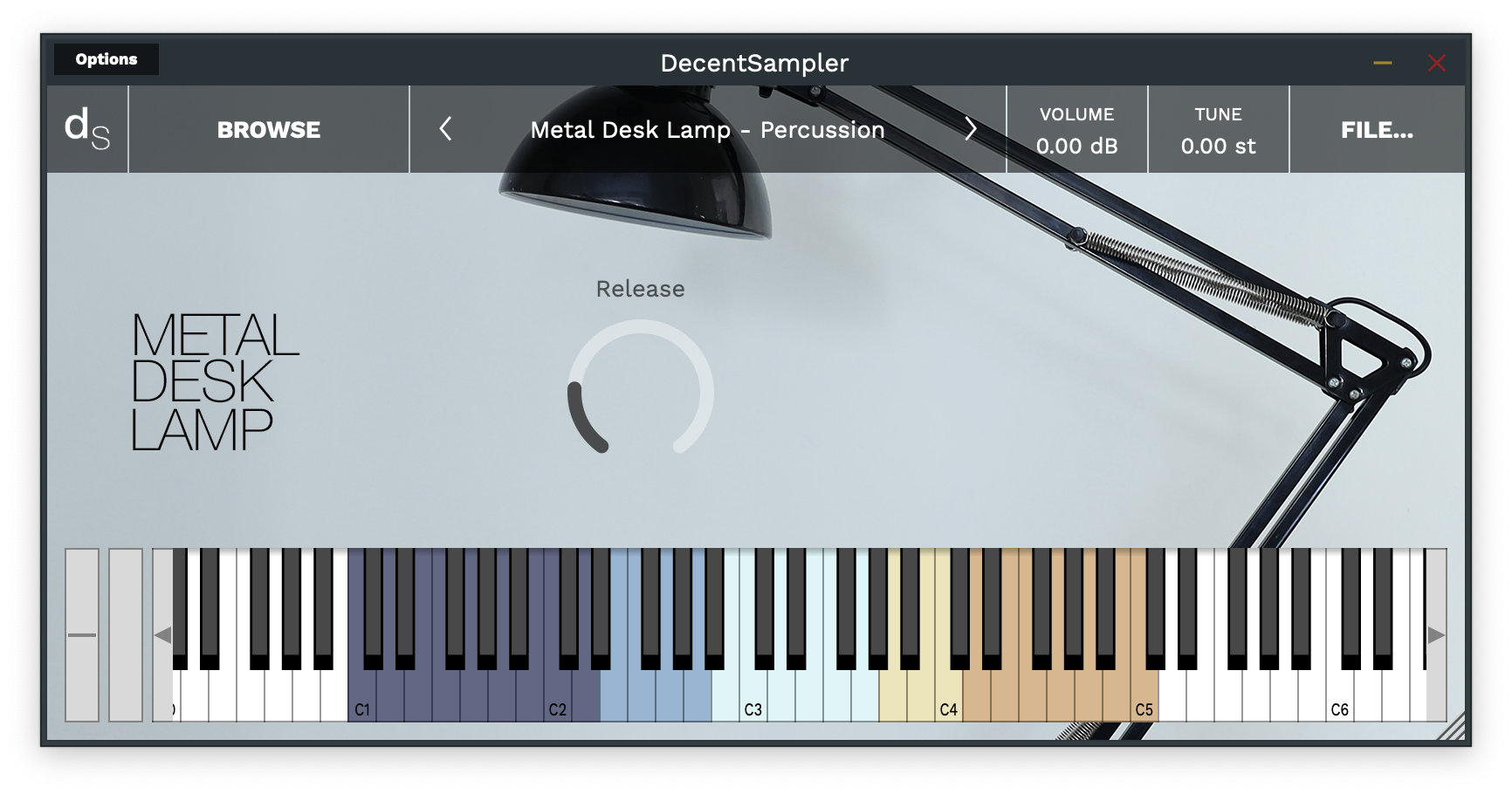
An example of the key coloring functionality

Version 1.4 of Decent Sampler recently got released: Download it here.

It brings with it a number of under-the-hood features that sample developers can make use of:

Colored Keys

It’s now possible to color the keys of the on-screen keyboard.

This can be useful for showing different ranges of notes that serve different purposes or highlighting notes used as keyswitches. In order to implement colored keys, make use of the new <keyboard> and <color> elements as follows:

<DecentSampler>
    <ui>
        <em><!-- Other stuffhere --></em>
        <keyboard>
            <color loNote="36" hiNote="50" color="FF2C365E" />
            <color loNote="51" hiNote="57" color="FF6D9DC5" />
            <color loNote="58" hiNote="67" color="FFCCF3F5" />
            <color loNote="68" hiNote="73" color="FFE8DA9B" />
            <color loNote="74" hiNote="84" color="FFD19D61" />
        </keyboard>
    </ui>
    <em><!-- Other stuff here --></em>
</DecentSampler>Code language: HTML, XML (xml)

By default, Decent Sampler highlights all of the notes that are mapped for a given sample. If you use the color keys feature, this default highlighting will be turned off and it will be up to you to color whatever keys you want.

Full documentation for the new elements is here.

Dropdown Menus

In order to implemented dropdown menus, use the new <menu> and <option> elements. The <menu> element defines where the dropdown menu will show up in the ui, whereas the <option> XML elements determine what menu options it has and what if anything those options actually do:

<menu x="10" y="40" width="120" height="30" value="2">
  <option name="Menu Option 1">
    <!-- Turn on this group -->
    <binding type="general" level="group" position="0" parameter="ENABLED" 
    translation="fixed_value" translationValue="true" />
    <!-- Turn off this group -->
    <binding type="general" level="group" position="1" parameter="ENABLED" 
    translation="fixed_value" translationValue="false" />
  </option>
  <option name="Menu Option 2">
    <!-- Turn off this group -->
    <binding type="general" level="group" position="0" parameter="ENABLED" 
    translation="fixed_value" translationValue="false" />
    <!-- Turn on this group -->
    <binding type="general" level="group" position="1" parameter="ENABLED" 
    translation="fixed_value" translationValue="true" />
  </option>
</menu>Code language: HTML, XML (xml)

In this example, a menu is being used to switch between two groups (the first menu option turns group 0 on and group 1 off; the section option turns group 0 off and group 1 on). Full documentation for the new <menu> and <option> elements is here.

The new fixed_value translation type

You’ll note, in the example above, there’s something new in the bindings: the four bindings elements have a translation parameter of type fixed_value. This is a new translation type. Up until now, binding translation has strictly been about taking an input parameter (such as a knob value or continuous controller amount) and translating it so that it is useful for some other purpose (it’s our way of being able to do a little bit of math without having a full-blown scripting language). This new fixed_value binding is different. It ignores the input value completely and instead provides whatever is specified in the translationValue parameter. In this way, each menu option can have hardcoded values that it provides its bindings when it is selected.

Keyswitches

It is now possible to implement keyswitches. For a long time, it’s been possible to trigger events when a MIDI continuous controller event is received: using MIDI CCs we can change knob values or group volumes, for example. It is now possible to trigger events using MIDI notes as well. Here’s what the setup for a MIDI note-based event mapping would look like:

<midi>
  <note note="11">
    <binding type="general" level="group" position="0" parameter="ENABLED" 
             translation="fixed_value" translationValue="true" />
    <binding type="general" level="group" position="1" parameter="ENABLED" 
             translation="fixed_value" translationValue="false" />
  </note>
  <note note="12">
    <binding type="general" level="group" position="0" parameter="ENABLED" 
             translation="fixed_value" translationValue="false" />
    <binding type="general" level="group" position="1" parameter="ENABLED" 
             translation="fixed_value" translationValue="true" />
  </note>
</midi>Code language: HTML, XML (xml)

In this example, MIDI note 11 turns on group 0 and turns off group 1, whereas MIDI note 12 does the opposite. Note the use of the fixed_value translation type.

More documentation on this can be found here.